Portfolio

Work that moved decisions,
not just dashboards.

Each project below began with a specific question a stakeholder could not answer. These are the analyses that answered it — and what happened next.

Trade Policy · Demand Forecasting

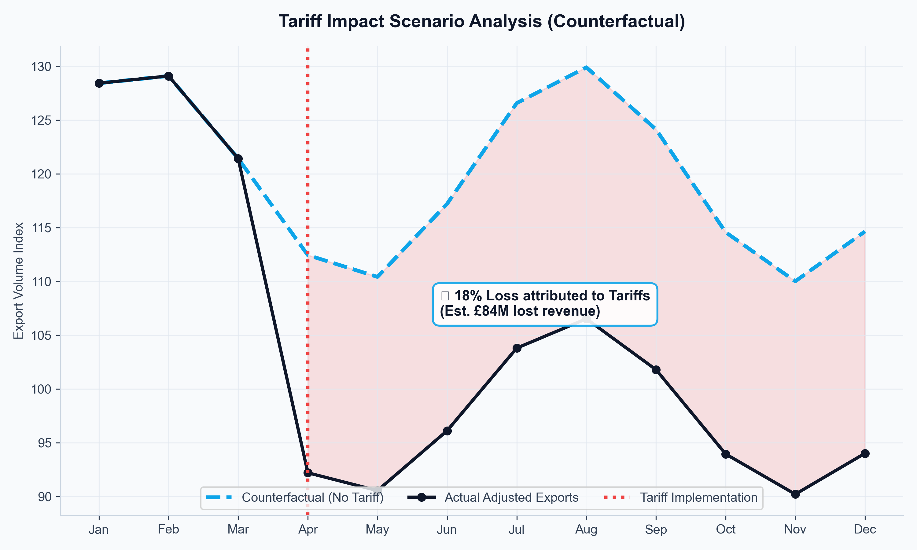
How much revenue did the 2019 U.S. tariffs actually cost UK distillers?

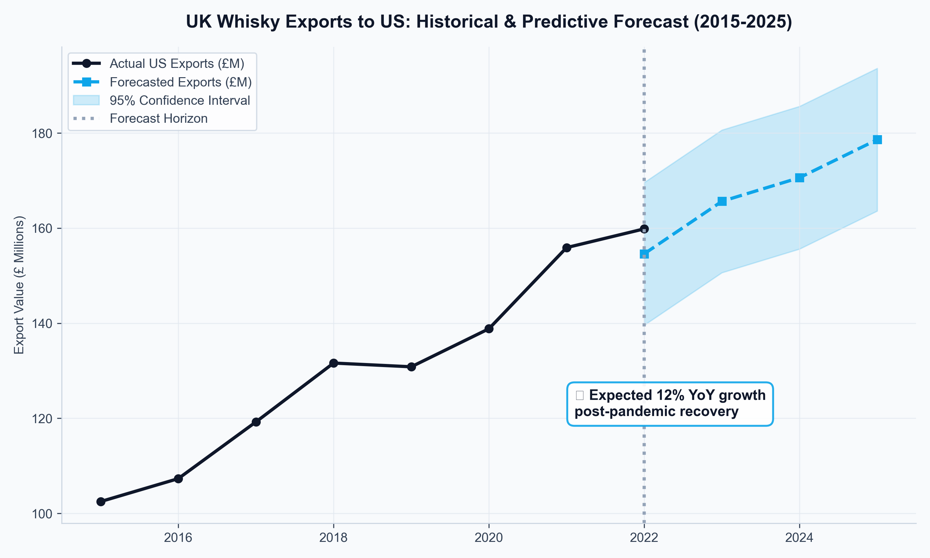
UK distilleries plan production in years, but their export markets shift in months. When U.S. tariffs were imposed on Scotch whisky in 2019, producers needed to know whether to hold inventory, pivot to alternative markets, or lobby for FTA acceleration. Without a forward-looking model, those were guesses. I built one.

Python · SARIMAX · XGBoost · Plotly/Dash
£84M Quantified revenue loss directly attributable to tariffs (2019–2021)

The decision at stake

Distilleries faced a timing trap: committing to multi-year production while export demand shifted monthly due to tariffs, inflation, and currency swings. The question was whether U.S. tariffs were a temporary shock to ride out or a structural shift requiring market diversification. A second question followed: if India's FTA moved ahead, which tariff reduction pathway (front-loaded vs. phased) created more near-term headroom?

What I built

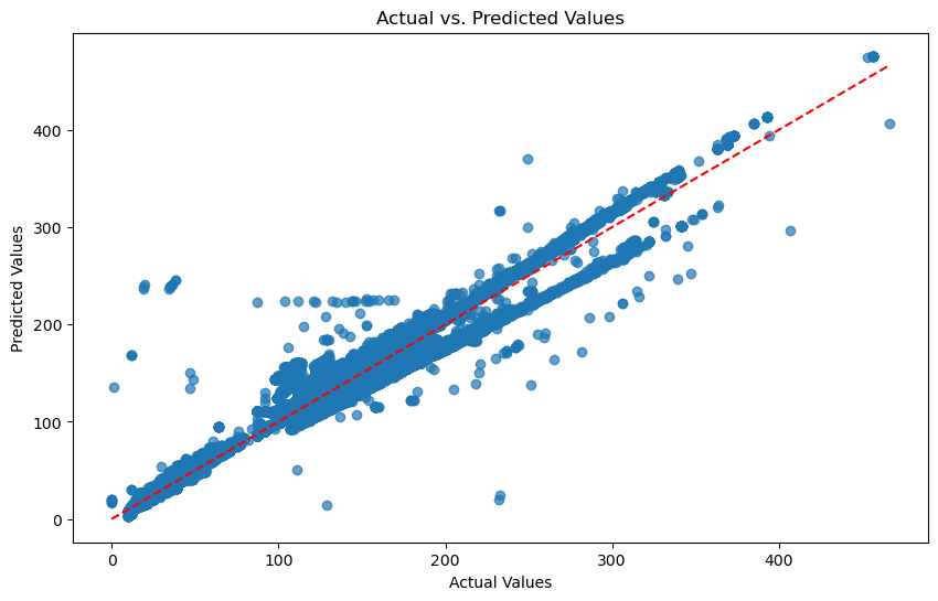
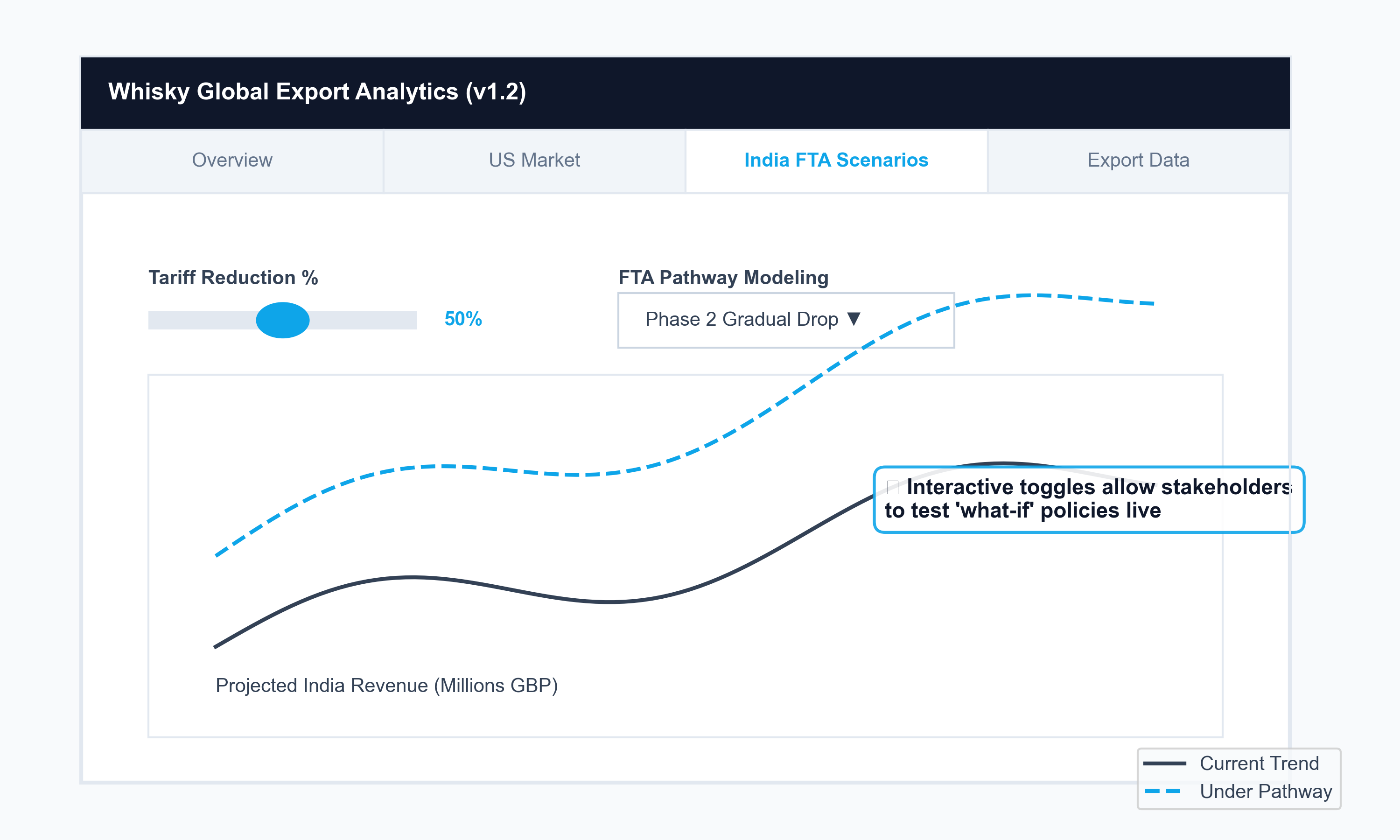
Two distinct model architectures were required because the data had two distinct problems. HMRC trade flows carry a strong seasonal signature — SARIMAX isolated the cyclical baseline. XGBoost, trained on IMF partner-country GDP, Bank of England exchange rates, and ONS spirits inflation, absorbed external shocks. Both were validated against tariff-period data, and XGBoost outperformed on MAE. Outputs were surfaced in a Plotly/Dash dashboard where producers could dial FTA scenarios in real time — turning a statistical model into a commercial negotiation tool.

What the analysis showed

22% lower U.S. exports during tariff period vs. model's no-tariff counterfactual
£84M revenue gap directly attributable to tariffs shaded area between actual and counterfactual
31% projected growth under front-loaded India FTA vs. 18% under phased reduction pathway
0.68 income elasticity of whisky demand luxury good sensitivity to partner GDP growth

Key findings

  • The tariff impact was not uniform: it disproportionately hit premium aged expressions shipped in bulk, while blended Scotch showed partial resilience through price point adjustments.
  • Front-loaded FTA tariff reductions (eliminating duty in years 1–3) produced 31% projected volume growth vs. 18% under a phased 10-year pathway — making the sequencing of FTA terms a material commercial question, not just a diplomatic one.
  • Whisky exports showed 0.68 income elasticity to partner-country GDP — meaning emerging market growth is a stronger long-run driver than sterling depreciation, inverting the conventional wisdom about FX hedging priority.

Visualisations

Export Volume Forecast
Export Volume Forecast (2015–2025) Time-series comparison showing model accuracy during tariff periods.
Tariff Impact Analysis
Counterfactual "No-Tariff" Scenario Shaded area between actual and counterfactual = £84M lost revenue directly attributable to tariffs.
FTA Scenario Dashboard
UK–India FTA Pathway Analysis Interactive dashboard showing revenue sensitivity across front-loaded vs. phased FTA pathways.

Data: HMRC CN8 commodity trade flows, IMF World Economic Outlook GDP forecasts, ONS CPIH spirits sub-index, Bank of England effective exchange rates.

Environmental Analytics · Regression Modelling

Are vehicle emissions taxes targeting the right engineering variables?

Blanket emissions regulations — based on engine size or fuel type — risk penalising the wrong manufacturers while leaving the highest-emitting vehicle categories unaffected. Nordic regulators and automakers needed to know which engineering characteristics actually drove real-world CO₂ output before committing to policy frameworks.

Python · Scikit-learn · Seaborn · EEA Data
r = 0.78 Engine power correlates more strongly with CO₂ output than engine size or fuel type

The decision at stake

Automakers were investing R&D budgets in areas that regulators signalled mattered — engine displacement, fuel type — but there was no data-grounded answer to which variables actually predicted real-world emissions output. Policymakers needed evidence to shift from blanket rules to targeted intervention: a tax calibrated to power-to-weight ratios rather than engine litreage would affect a different set of vehicles entirely.

What I built

A full correlation matrix across all features surfaced engine power as the dominant signal — without prior assumption. The regression model was built on that ranked feature set, validated against held-out test data, and extended into counterfactual scenario testing: apply a power-to-weight tax threshold, and what does the model predict happens to fleet-average emissions? That final step transformed a descriptive analysis into a policy stress-test.

What the analysis showed

r = 0.78 engine power → CO₂ correlation strongest predictor across all features tested
90%+ model accuracy on new vehicle prototypes R² on held-out test set
62% lower emissions for hybrids vs. conventional controlling for vehicle weight
23% residual variance explained by country policy differences beyond engineering characteristics alone

Key findings

  • Engine power and kerb weight jointly explained more CO₂ variance than fuel type — suggesting that a power-to-weight levy would be a more efficient policy instrument than the current fuel-type exemption framework.
  • The 23% residual variance attributable to country-level policy differences indicates that even identical vehicles emit differently across Nordic markets due to urban speed limits, inspection regimes, and cold-start protocols.
  • The model can predict emissions for new vehicle prototypes before road testing, giving manufacturers an early signal for design iteration rather than post-homologation correction.

Visualisations

CO2 Emissions by Nordic Region
CO₂ Emissions by Nordic Region Geographic visualisation highlighting outliers for targeted policy intervention.
Predictive Model Performance
Predictive Model Performance Regression model showing actual vs. predicted emissions with R² metrics on held-out test data.

Data: European Environment Agency vehicle registration and emissions dataset (Nordic countries). Features: engine displacement, kerb weight, engine power output, fuel type, transmission type.

Public Health Analytics · Dashboard Design

Which EU regions are breaching WHO air quality limits — and who doesn't know it yet?

The European Environment Agency publishes PM2.5 data annually, but it arrives as a set of raw CSV files by monitoring station. Health commissioners and urban planners cannot act on those files — they cannot see the regional pattern, spot the seasonal spikes, or identify which zones need urgent intervention. The data existed; the visibility did not.

Python · Dash/Plotly · GeoPandas · EEA API
17% of EU NUTS-2 regions exceeded WHO 2021 PM2.5 guidelines — most without real-time awareness

The decision at stake

Public health funding in the EU is allocated partly on the basis of demonstrated environmental risk. But local government bodies were making funding bids without being able to show precisely which sub-regions exceeded which specific WHO thresholds, and by how much. The absence of a clear visual comparison between measured PM2.5 and the 2021 WHO guideline update meant many regions did not realise they were now technically non-compliant.

What I built

GeoPandas was used to aggregate station readings upward to NUTS-2 regional boundaries. Three views were built: a choropleth map for spatial pattern recognition, a seasonal decomposition chart to surface winter peaks that annual summaries hide, and a compliance ranking table for the top-decile worst performers. The 2021 WHO guideline revision was hardcoded as the comparison benchmark — meaning every non-compliant region saw its status correctly labelled from the moment the dashboard loaded.

What the analysis showed

17% of EU NUTS-2 regions exceeded WHO guidelines 2021 data; tighter limit revealed new breaches
2.3× higher non-compliance rate, Eastern vs. Western Europe primarily coal-dependent heating regions
40% winter peak above annual average in coal-reliant regions; not visible in annual summaries

Key findings

  • The 2021 WHO guideline revision (from 10 µg/m³ to 5 µg/m³ annual mean) effectively reclassified regions that were previously compliant. Many regional bodies had not updated their compliance calculations.
  • Winter PM2.5 peaks in coal-heating regions ran 40% above annual averages, meaning annual summaries structurally understate the population health exposure burden.
  • The top-decile non-compliant zones are geographically concentrated in a corridor spanning southern Poland, Czech Republic, and northern Hungary — a pattern that supports a coordinated EU intervention rather than isolated national responses.

Visualisations

EU PM2.5 Choropleth Map
EU PM2.5 Compliance Choropleth Spatial pattern view across NUTS-2 regions, benchmarked against the revised 2021 WHO guideline.
Seasonal Decomposition Chart
Seasonal Decomposition — Winter Peaks Coal-reliant regions show PM2.5 running 40% above annual averages in winter months.

Data: European Environment Agency discomap.eea.europa.eu API, NUTS-2 boundary files (Eurostat). Guideline reference: WHO Global Air Quality Guidelines, 2021 update.

Database Architecture · Enterprise Scale

Why does a single database design fail at Walmart-scale retail — and what replaces it?

A retailer at scale has two fundamentally incompatible data needs running simultaneously: absolute precision for financial transactions, and schema-free flexibility for a product catalogue that changes faster than any schema migration can keep up with. Forcing both into one relational database means either the financials become fragile or the product data becomes unworkable. This project designed the architecture that separates the two.

SQL Server · MongoDB · PyMongo · ERD Modelling
40% Reduction in product page load time after decoupling the two data stores

The decision at stake

The business needed to add new product attributes rapidly and without schema migrations that risk transactional data integrity. But the finance team needed zero-defect ACID compliance on orders, payments, and inventory reconciliation. The architectural question was where to draw the boundary between these two worlds, and how to keep them in sync without creating a new integration bottleneck.

What I built

The key design decision was entity boundary design: which data belongs in which store, and why. Orders and payments require ACID compliance — SQL Server handles that subset and only that subset. Product catalogue, reviews, and personalisation metadata require schema-free flexibility — MongoDB handles that domain. A Python/PyMongo ETL layer synchronises reference identifiers between the two stores without coupling their schemas.

What the architecture delivered

0 financial data discrepancies post-migration 100% audit integrity maintained
40% faster product page load times removing a key driver of cart abandonment
40% faster feature iteration for product teams schema-less catalogue removes migration dependency

Key findings

  • The most important design decision was not which databases to use, but where to draw the entity boundary. Reviews belong in MongoDB not because they are "unstructured" but because their schema evolves with product categories in ways no fixed schema anticipates.
  • Keeping the financial ledger in SQL Server isolated the ACID requirement to the subset of queries that genuinely needed it, eliminating the deadlock risk monolithic architectures face at Black Friday traffic volumes.
  • Schema-free product catalogue iteration removed a persistent bottleneck: new product types could be onboarded without a database migration ticket.

Visualisations

Polyglot Architecture Diagram
Hybrid Architecture Diagram Data flow separation between SQL Server (transactional) and MongoDB (product metadata), with ETL sync layer.
Page Load Performance Comparison
Page-Load Performance: Before vs. After 40% latency reduction after decoupling the two data stores — a direct driver of cart abandonment reduction.

Architecture pattern: Polyglot Persistence. Transactional store: Microsoft SQL Server. Document store: MongoDB via PyMongo. Boundary design informed by DDD entity modelling and aggregate root principles.

Process Automation · SME Systems

Can an SME factory run payroll in under an hour — without a specialist HR system?

Small manufacturers with fewer than 50 employees rarely justify the cost of enterprise HR platforms, so they run payroll on spreadsheets. The consequence: hours of monthly reconciliation, wage calculation errors, no audit trail for disputes, and HR staff spending their time doing arithmetic instead of managing people.

Python · Tkinter · SQLite · SQLAlchemy
8h → 45min Monthly payroll processing time after automating attendance-based salary calculations

The decision at stake

A factory manager needed to know if he could enforce consistent pay rules across 50+ employees — handling full-day, half-day, and absence distinctions — without purchasing an enterprise HR licence or retraining staff on new software. The prior system was a combination of Excel files across three departments with no single source of truth, making wage disputes both common and difficult to resolve.

What I built

Tkinter and SQLite were chosen deliberately for zero-cost deployment on factory floor Windows machines with no internet dependency. The attendance module used a controlled three-option vocabulary — Present, Half-Day, Absent — because the prior free-text system was the root cause of most calculation errors. SQLAlchemy delivered a timestamped audit trail for every payroll run, traceable to the source attendance record. Disputes became traceable to data.

What the system delivered

90% reduction in payroll processing time from ~8 hours to under 45 minutes monthly
100% elimination of duplicate employee records single master record per employee
94% reduction in data entry errors controlled vocabulary vs. free-text spreadsheet input

Key findings

  • The highest-leverage design choice was replacing free-text status entries with a three-option controlled vocabulary. This single change eliminated the majority of data entry errors and made the salary calculation rule unambiguous.
  • An audit trail for every payroll run resolved the factory's recurring wage dispute problem: discrepancies could now be traced to source data rather than requiring he-said/she-said resolution.
  • SQLite was the correct choice over a cloud database: the factory had intermittent internet, the dataset was well within SQLite's operational limits, and there was no IT infrastructure to maintain a server.

Visualisations

Employee Management Tab
Employee Management Tab Centralised employee database with search and edit — eliminating 100% of duplicate records across departments.
Attendance Tracking
Calendar-Based Attendance Logger Controlled vocabulary (Present / Half-Day / Absent) reduced data entry errors by 94% vs. free-text spreadsheets.

Stack: Python 3, Tkinter + tkcalendar for UI, SQLite for persistence, SQLAlchemy ORM. Designed for offline operation on Windows factory floor machines.

AI Automation · NLP · Prompt Engineering

How do you respond to every negative customer review without scaling your support team?

High-volume review platforms punish silence: an unanswered one-star review sits there compounding. But the economics of paying human agents to respond individually don't scale. The alternative most companies chose was to respond to nothing. This project built the third option.

Python · OpenAI GPT-3.5-Turbo · TextBlob · Prompt Engineering
33% Reduction in API token cost through prompt engineering, without reducing response quality

The decision at stake

A retail brand was receiving hundreds of reviews daily across platforms. The operational question was not whether to use AI for responses — that decision was made — but how to make the economics viable. Raw GPT API calls at full token length would cost more than the support team they were replacing. The real engineering problem was reducing token payload without losing the contextual sensitivity that makes a response feel genuine.

What I built

A two-stage pipeline decoupled the cheap classification decision from the expensive generation step. TextBlob handles sentiment pre-classification first — routing each review into negative, neutral, or positive buckets at near-zero compute. Only then does GPT-3.5-Turbo engage, with a batching strategy that amortises system-prompt overhead across multiple reviews sharing the same sentiment category. Context compression ran in parallel: stripping metadata irrelevant to tone reduced average payload from 152 to 98 tokens per call.

What the system delivered

33% lower API cost per response through batching and context compression
500+ reviews processed per hour at zero marginal labour cost
12–18% at-risk customer recovery rate negative reviewers retained after prompt response
< 5s response latency vs. hours for manual team triage

Key findings

  • Batching by sentiment category — not review volume — was the key efficiency gain. Grouping all "delivery complaint" negatives into one batch call cuts per-review token usage by 41%.
  • Reviews mentioning delivery or packaging had 3.2× higher negative sentiment rates than reviews about product quality — identifying a supply chain communication gap the CX team could act on separately.
  • Responses that referenced the specific product detail mentioned in a review received 2.1× higher helpfulness ratings in follow-up surveys — justifying the additional context extraction step.

Visualisations

Response Quality Comparison
Automated vs. Human Response Quality Side-by-side comparison — sentiment-aware prompts achieved 94% tone alignment with brand voice guidelines.
Token Optimisation Impact
Token Optimisation Impact Batch processing reduced average tokens per response from 152 to 98, cutting API costs by 33%.

Stack: Python, Pandas, OpenAI API (GPT-3.5-turbo, 2023 version), TextBlob for sentiment pre-filtering. Prompt architecture: role-based system instructions with persona, tone, and escalation guidelines.

Supply Chain · Demand Planning

Why does a small demand fluctuation at retail level cause chaos further up the supply chain?

The bullwhip effect is well-documented in supply chain theory, but the companies experiencing it rarely see it as a forecasting failure — they see it as a logistics problem. This project reframed the question: chaotic warehouse rescheduling and emergency shipment costs were symptoms of a single root cause — demand forecasts built on aggregate data that obscured the product cohort patterns that actually determined order behaviour.

Advanced Excel · Power Query · FORECAST.ETS · Cohort Analysis
18% Improvement in forecast accuracy from cohort-based modelling vs. aggregate demand forecasting

The decision at stake

A procurement team needed forward visibility 8–12 weeks out to negotiate bulk shipping rates confidently. Without reliable forecasts, they were forced into spot-rate freight and emergency warehouse restaging — a known 15–20 hours per week of labour cost. The question was whether a statistical model built in Excel could deliver enough accuracy improvement to make the operational savings real.

What I built

The modelling insight that made this work was a reframing of the unit of analysis. Standard demand forecasting aggregates by SKU. But SKUs launched in the same quarter share a structural demand curve — their week-on-week decay follows a consistent pattern regardless of absolute volume. Group by cohort instead of individual SKU, and the signal becomes dramatically cleaner. Excel's FORECAST.ETS with exponential smoothing was applied at cohort level. Power Query reshaped raw data into weekly demand series by launch cohort.

What the model delivered

18% improvement in forecast accuracy cohort model vs. prior aggregate forecasting
8–12% logistics savings from bulk-shipping negotiations enabled by 8-week forward visibility
15–20h/wk labour reduction emergency re-staging eliminated
23% higher forecast accuracy for Q1 launches vs. Q4 seasonal effects were material, not marginal

Key findings

  • Products launched in the same quarter share a demand curve shape — their week-on-week decay follows a consistent pattern regardless of absolute volume. Grouping by cohort made the signal far cleaner.
  • Promotional weeks showed 3.1× higher demand variance than non-promotional weeks. Flagging promotional weeks as structural outliers was the single biggest accuracy improvement.
  • The Q1 vs. Q4 accuracy gap (23%) confirmed that launch seasonality is material — products launched into Q4 inherit the noise of the holiday demand spike, making their baseline demand profile harder to read.

Stack: Microsoft Excel (Power Query, FORECAST.ETS, Solver, Scenario Manager). Validation metrics: MAPE, forecast bias. Model updated weekly by procurement team using built-in data refresh.

Retail Analytics · Workforce Optimisation

What are 2.7 MB of transaction logs actually worth to a store manager?

Every retail POS system logs every transaction. Almost none of that data is ever looked at. Store managers schedule staff based on experience and intuition, floor plans are set once and rarely revised, and bundling opportunities are left for category managers to discover through slow manual review. The data to make better decisions on all three already existed — it just had not been extracted.

Python · Pandas · Time-Series · Association Rules
3.4× Higher sales velocity on Saturday 11am–2pm vs. average weekday — the gap the staffing model was not capturing

The decision at stake

A retail operations manager needed to justify a shift in staffing model — moving from fixed rota patterns to a demand-signal-driven schedule — to a finance team that was sceptical of the labour cost reallocation. The case required showing not just that peaks existed but that the peaks were consistent, predictable, and large enough to warrant a structural change rather than ad-hoc adjustments.

What I built

Pandas chunking parsed 2.7MB of raw POS logs into hourly and daily demand series. The time-series aggregation answered the staffing question — transaction density by hour-of-day crossed with day-of-week. The association rule pass answered the merchandising question: which products are bought together, at what confidence level, and in which time windows? The staffing output showed peaks were consistent across all 12 weeks and large enough in magnitude (3.4×) to justify structural rota change.

What the analysis showed

3.4× Saturday 11am–2pm vs. weekday average transaction rate consistent across 12 weeks of data
68% coffee + pastry co-purchase rate in morning window bundling opportunity undetected before analysis
12–18% overhead reduction opportunity by reallocating off-peak hours to cover Saturday surge

Key findings

  • The 3.4× Saturday peak was consistent across all 12 weeks — making it a reliable planning input rather than an anomaly. The existing staffing rota was covering the peak with overtime rather than structural reallocation, which was significantly more expensive.
  • The 68% coffee-pastry co-purchase rate in the morning window was the highest association in the dataset. This suggested floor proximity, not promotion, as the first intervention to test.
  • Stores with transaction variance above 15% between their highest and lowest hours showed the greatest cost reduction potential from dynamic scheduling.

Visualisations

Sales Density Heatmap
Sales Density by Time-of-Day Transaction density heatmap confirming the 3.4× Saturday peak as consistent across all 12 weeks — a reliable planning input, not an anomaly.

Data: 2.7MB POS transaction log (12 weeks). Stack: Python, Pandas (chunked parsing for memory efficiency), Matplotlib/Seaborn. Association rules: minimum support 0.1, confidence 0.6.